Geposit - Atlas
- Client Geposit
- About client Geposit is a small company that works with addresses, ZIP codes, and maps. They are active in the Nordic countries.
- My role UX/UI designer
- Team with PO and developer
- Project time 2 months, March-April 2018
- Type Web
- Tools Pen and paper, Sketch, Invision and Zeplin
Background
Geposit has a product called Geposit Atlas, which is a map service for companies who works with sales districts and want to build areas on a map. The service also lets you see statistics on the area you have built. Geposit Atlas is a merge between two existing products.
Problem
Geposit got some feedback from their customers about the interface on Geposit Atlas that it didn't look up to date and it's not easy to understand. They haven't used their design guidelines or branding at all.
Goal
Make it more comprehensible, no matter if you are a new or an old user. Use the design guidelines as much as possible and also make it more appealing.
Process
The first days started with meetings with PO and front end developer, to talk about what problem Geposit Atlas has struggled with. They have collected feedback from their customers and internal. From that, I made a priority list with all the issues they had on Trello.
I also looked into who their competitors are, to see what their strengths and weakness are compared to Geposit Atlas.
Geposit Atlas is only designed for desktop because their customers sit with their computer at their office, mapping out their area. That is why I started off doing some sketching on paper for desktop.
I had two challenges. One was to make it easy to understand for the user on how to use this tool. New users didn't know where to start. I sketched out a few different ideas. One was with steps but I ended up with the solution on having a quick introduction. With the introduction, the user gets to see the interface of the product and a highlighted section so they can focus on one item at a time so it won't be too overwhelming for them. They can go back and forth to read a little information and when they are done they can choose by themselves where they want to start with the information they've got.
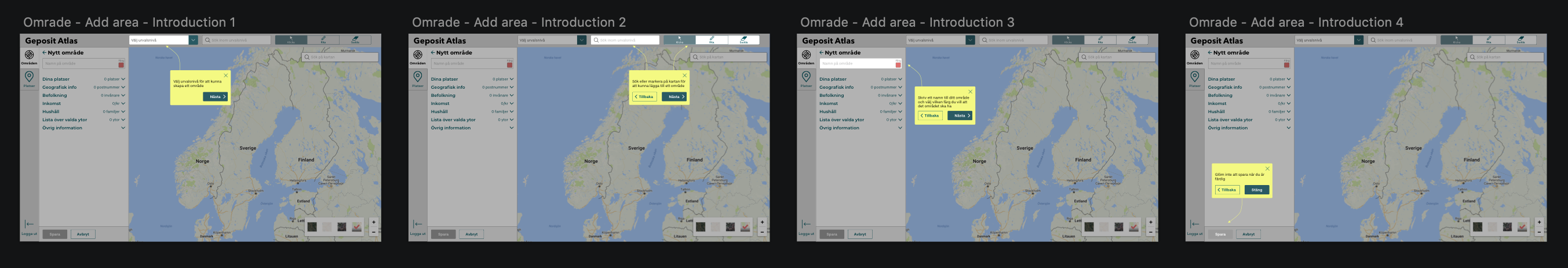
Introduction wireframes
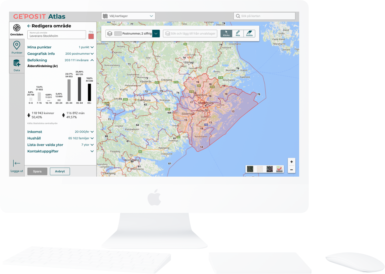
My other challenge was how to fit all the information and the adding area/pin to a certain area without blocking the map and not make it cluttered. I made a few different variations until I decided a final design with having the information and adding area to the left and the toolbox on top. I used Google Material Design for inspiration.
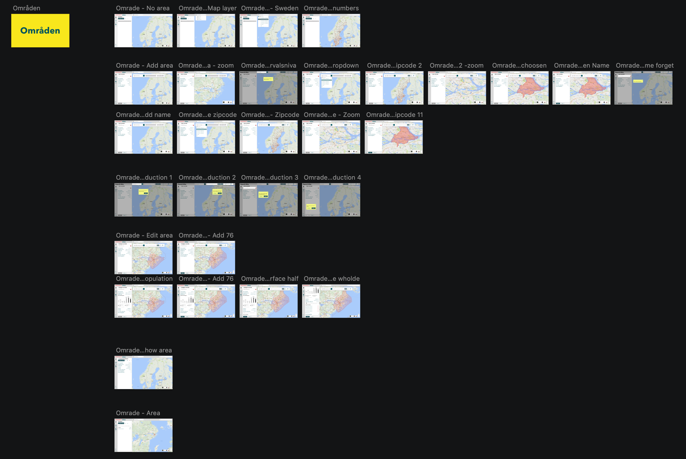
Wireframes on the adding area
Unfortunately Geposit couldn't provide any of their customers to join a usability test so I did some internal usability tests instead.
I made a prototype in InVision for the usability testing.
Link to desktop prototype (Swedish): Geposit Atlas
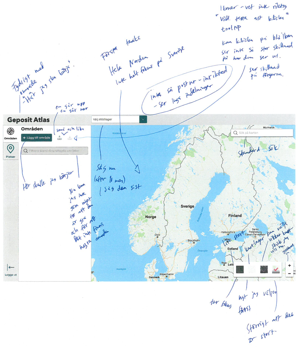
Notes I wrote while doing usability testing
I made wireframes in Sketch and used colors, font, and icons from their design guidelines.
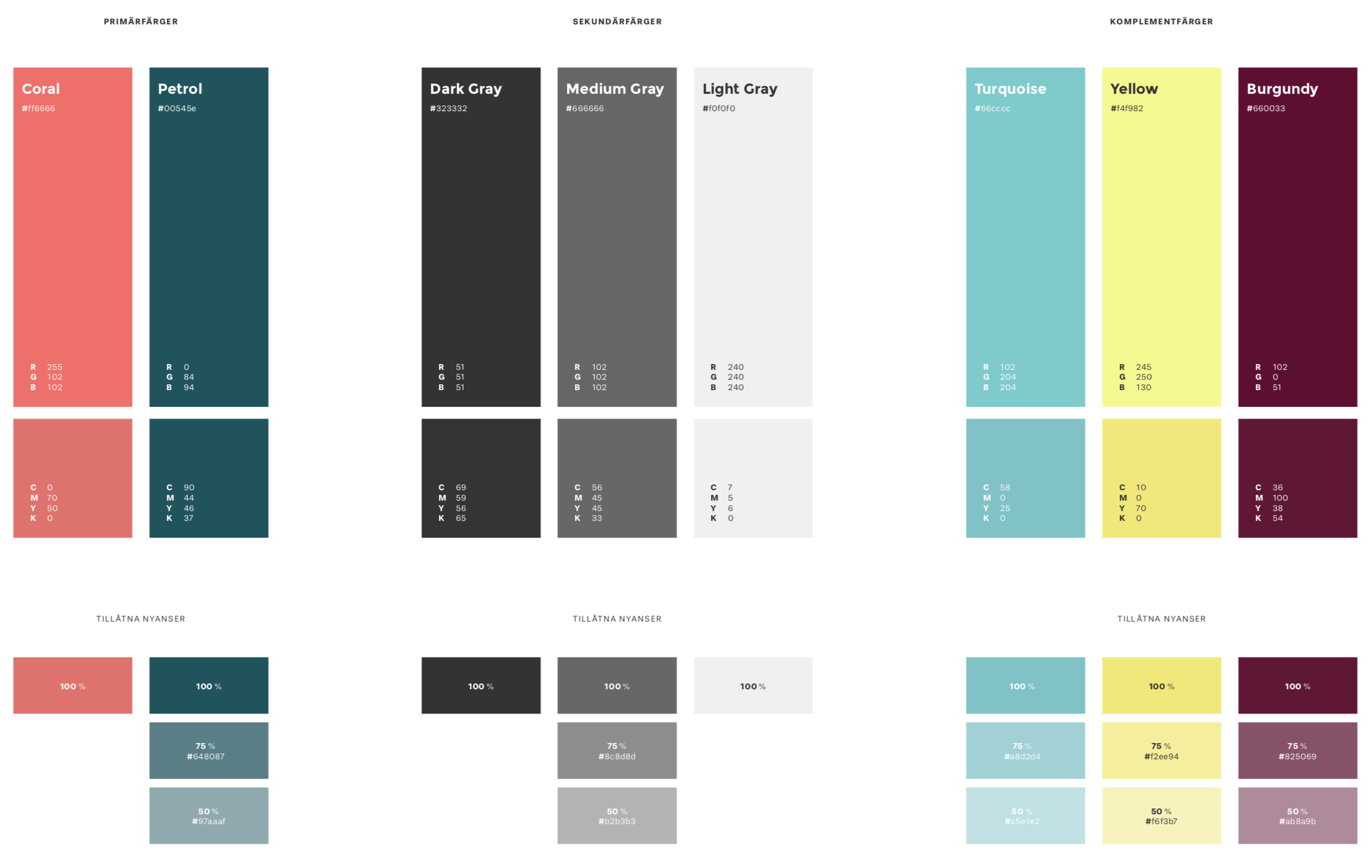
Color swatches from the design guidelines